One618
An event production company based in Chicago, IL


The Brief
ONE618, INC is an event production company based in Chicago, IL whose work expands to multiple facets of the entertainment industry, including concerts, corporate events, dance, festivals, television, and theatre. They provide services such as lighting, architecture, video, and photography. They’ve worked celebrities such as John Legend, Kelly CLarkson, NFL, and Chi Town Rising.The founders wanted to develop an online presence and launch a website that highlights their 60 years of experience and improve the usability for current clients while increasing the acquisition of new clients. ONE618 asked our team of three UI designers to create a responsive website and mobile design to distinguish them from their competitors.
Requirements
- Clean, concise, and thoughtful. Modern design, visually stunning, with some microinteractions in mind.
- The primary goal of the web page is for users to feel inspired and illicit a sense of awe that will motivate clients to work with the company.
- Use of black and white as the primary colors with a hint of gold.
Deliverables
- Wireframes
- Style Tiles
- High Fidelity Mockups
- Comprehensive Style Guide
Visual Competitive Anaylsis

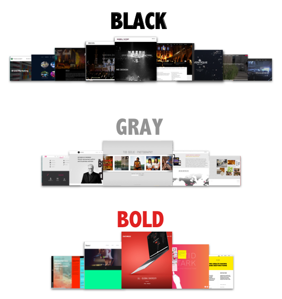
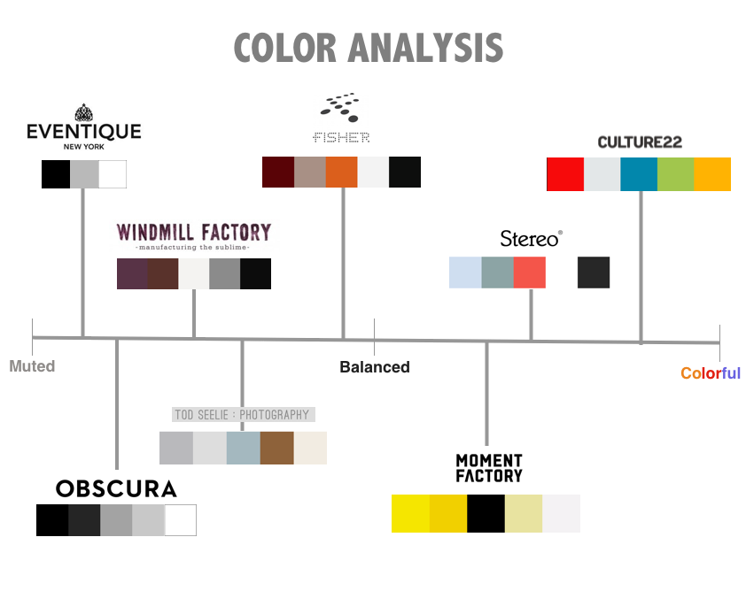
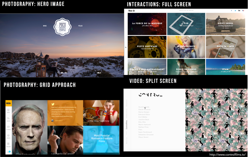
As a team, we kicked off the project by performing a visual competitive analysis of similar event production companies as well as studying industry trends across applicable industries. The analysis included photography, microinteractions, video, and layout conventions. In our research, we found that many competitors used black and white as their main color palette and only a handful were using bold colors. Another common trend was the use of large hero images on the homepage. Although the client had clearly expressed the desire to use black and white as their main color palette, our analysis identified an opportunity in exploring other colors. Additionally, we identified an opportunity to differentiate the website by showcasing photography in another way that isn’t the typical hero image.
After we finalized our analysis and identified the opportunities, the team met with the stakeholders to present our findings, in which they agreed to explore other colors and different photo layouts. With the buy-in of the stakeholders, each member of the UI team began developing style tiles.
Style Tiles
Each team member developed 3 different style directions for the clients to choose from.
Style 1:
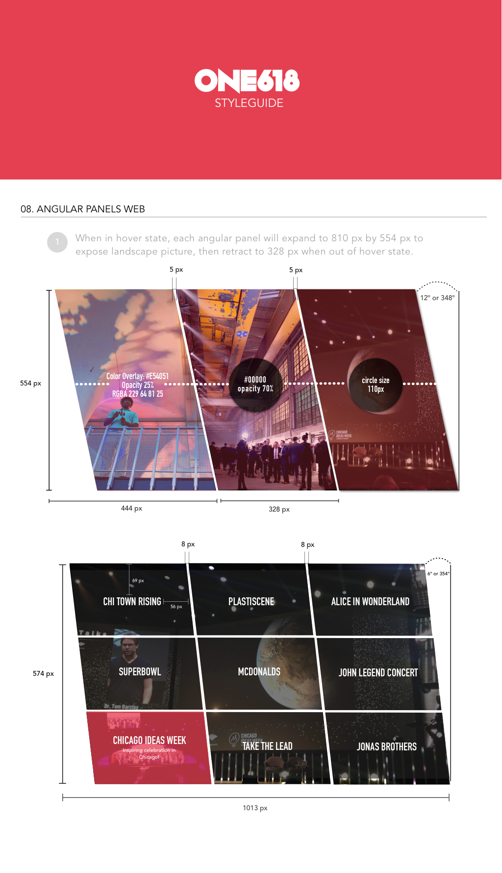
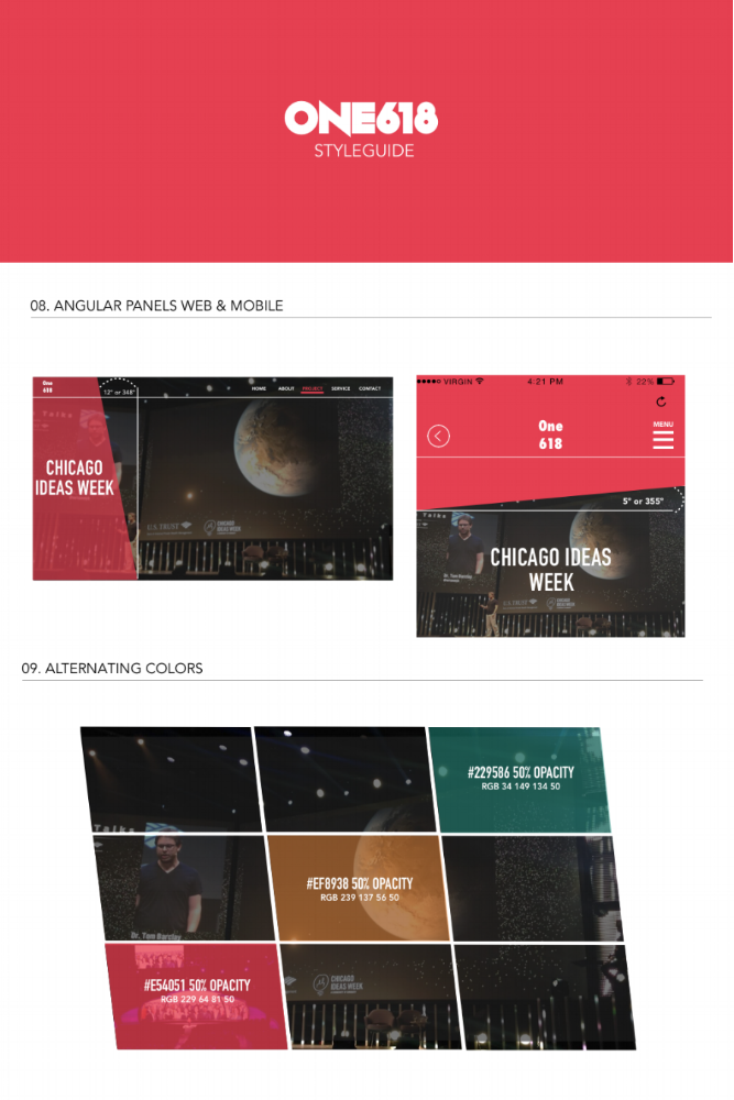
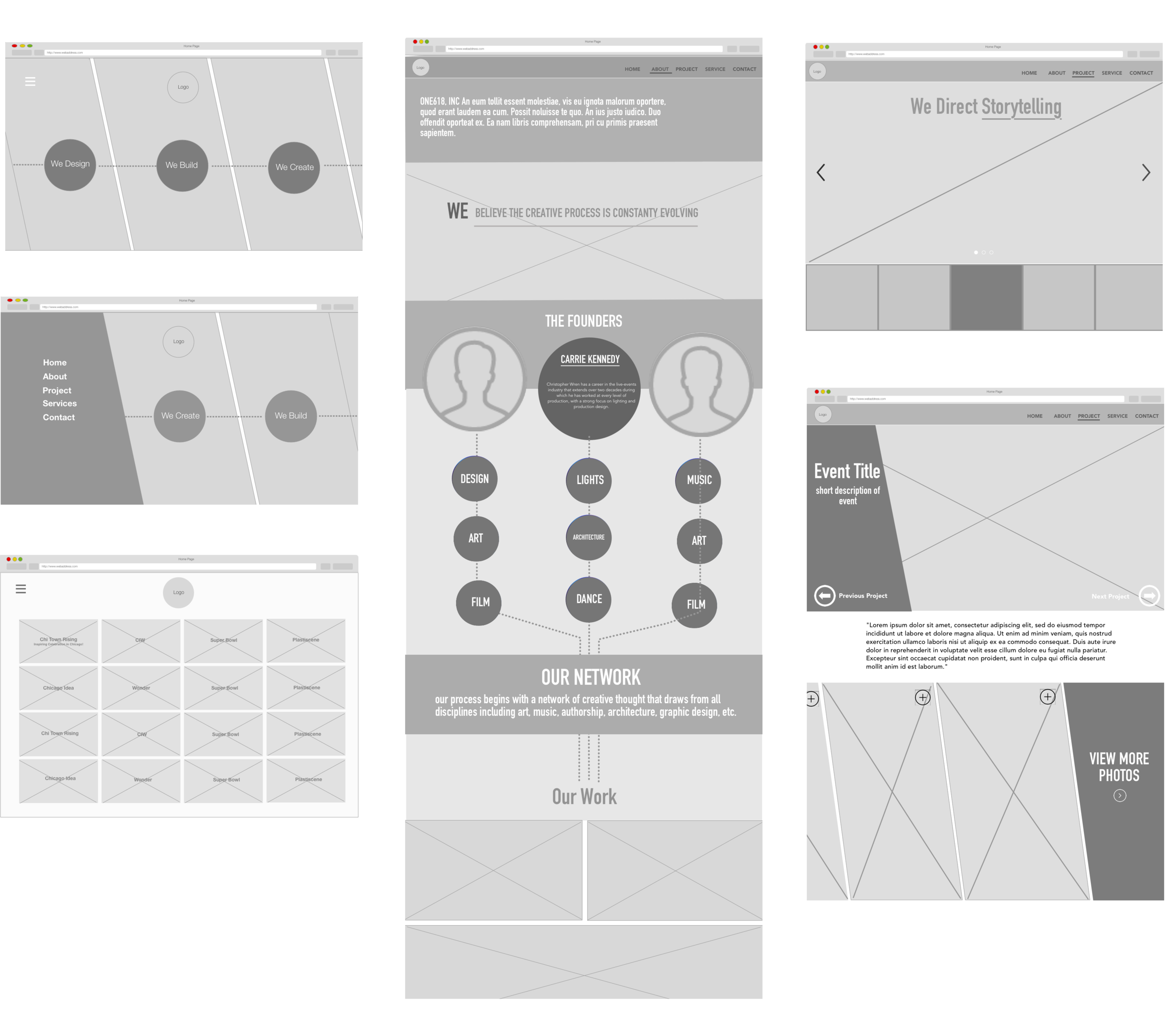
In this first style tile, I wanted to deviate from the typical hero image seen numerous times in the competitive analysis and do something that would display photos in a unique way. A slanted design that would make the site look more modern and cutting-edge. This style would be an interactive photo layout that includes microinteractions that allow the user to hover over each photo and expand it to a full image. The change in the layout of images allows users to decide if an image is useful to them and gives them the affordance to further interact with each image.
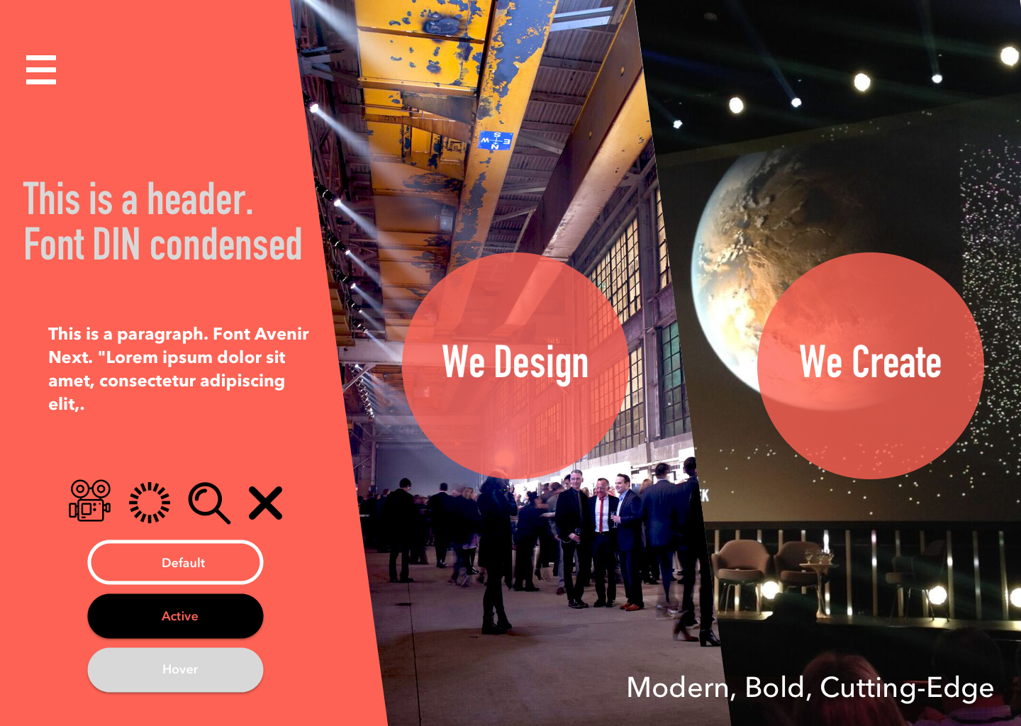
Style 2:
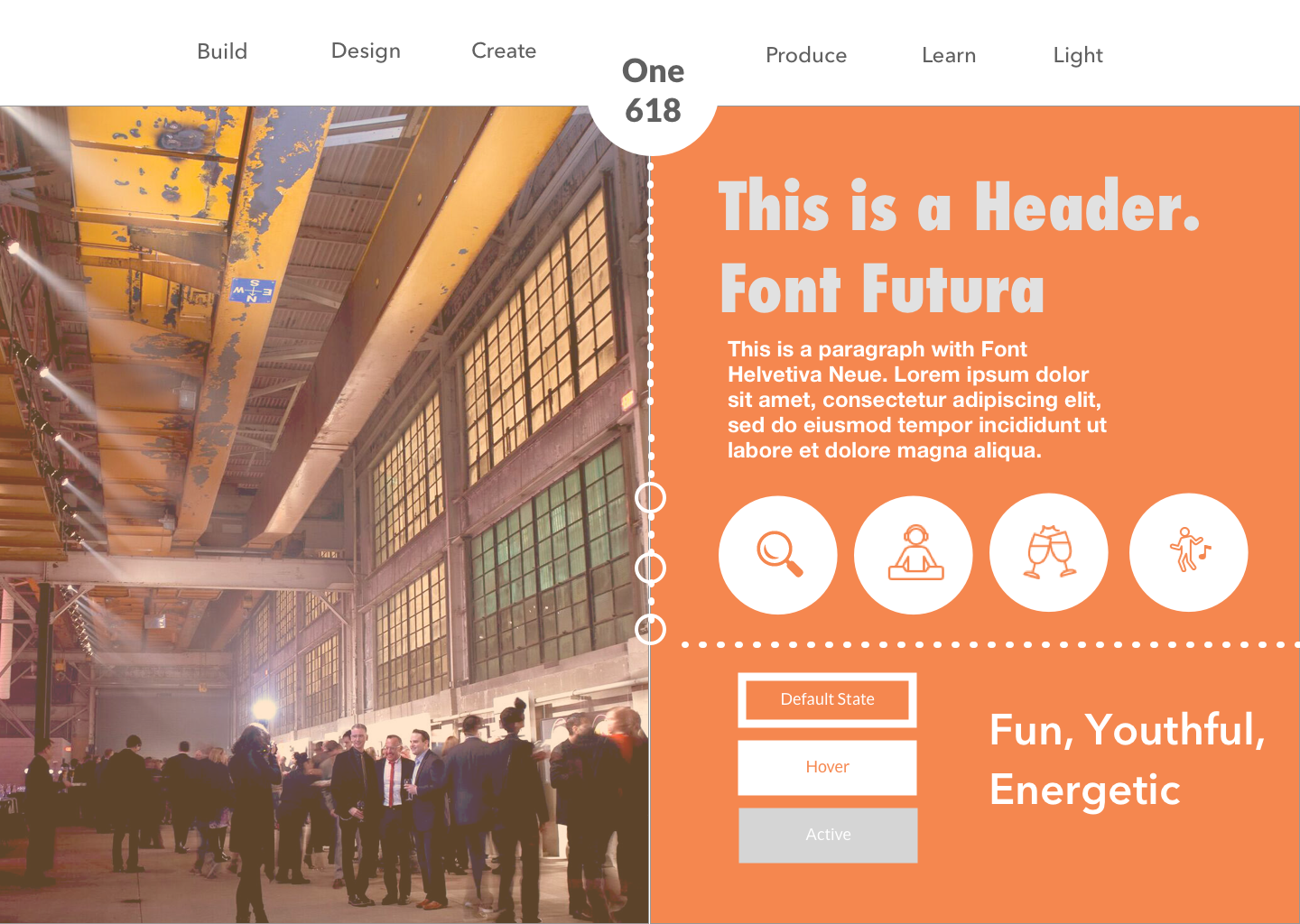
In this design, I used a half page design to differentiate from the typical hero image used on other home pages. I mixed in orange tones to make the website reflect the fun and exciting feelings that would describe the client’s projects.
Style 3:
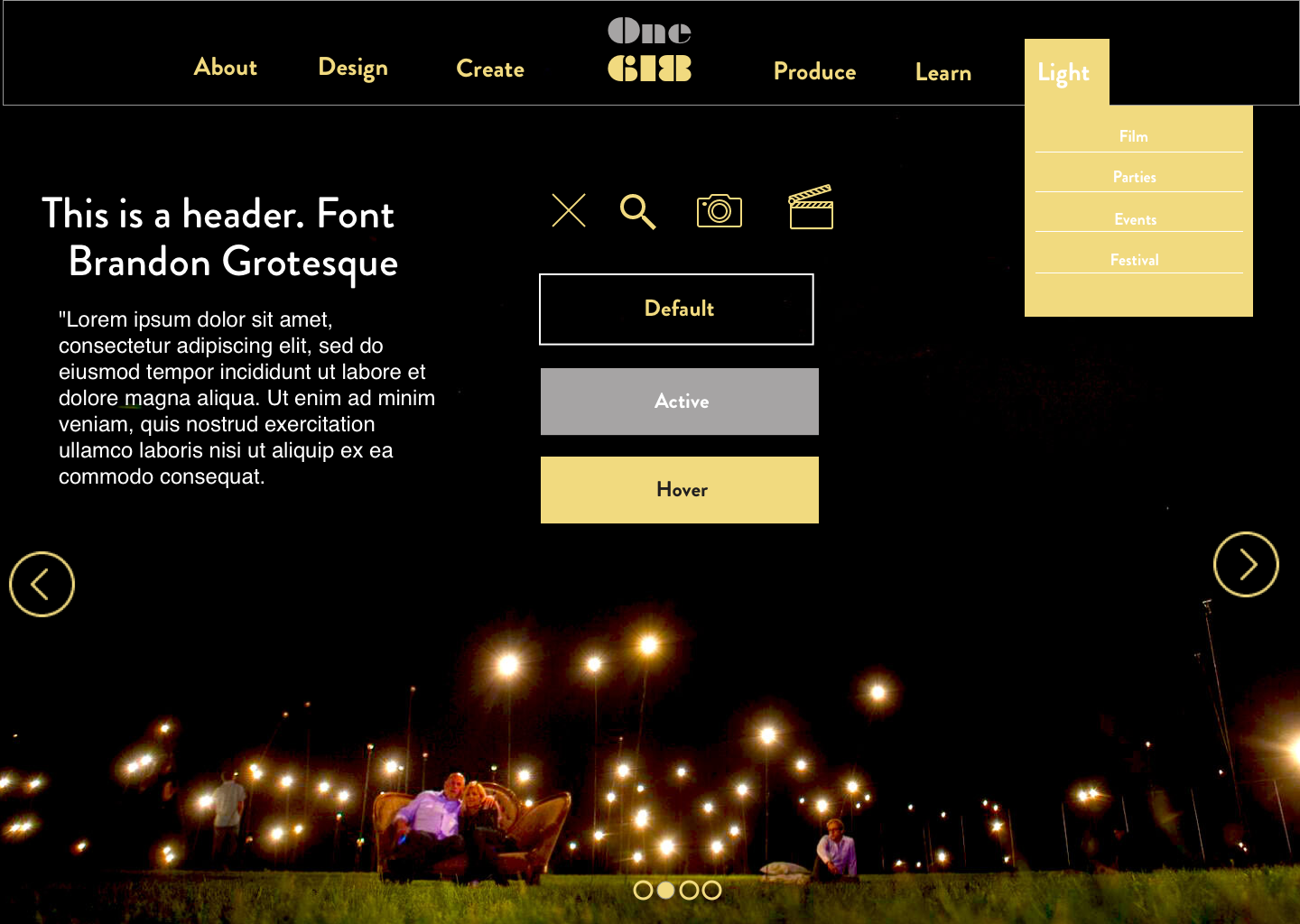
For this design,I used the black, white, and gold color palette requested by the client. For this style, I wanted the webpage to be emphasized by large photography that had been edited to showcase light exposure. The company specializes in light production and a design with an emphasis on lighting would highlight the unique value of their projects.
After reviewing the three designs, the clients chose the first style but requested to remove the hamburger menu and use a traditional navigation bar instead.
Wireframes
Before we were able to start on the high-fidelity mockups, we had to create wireframes and determine the information architecture for the final design. The client provided a sitemap of their current website, which consisted of only one page with a contact form. Because our design required additional pages, we had to create a new architecture to present the information.

The Product
After two rounds of presenting our work and receiving feedback from the client, I arrived at my final designs. I incorporated changes from the client’s feedback, which included adding the traditional navigation bar and breadcrumbs on each page to make it easier for users to navigate the website.

Home Page Projects Page

Project Overview

Process Page

About Us Page
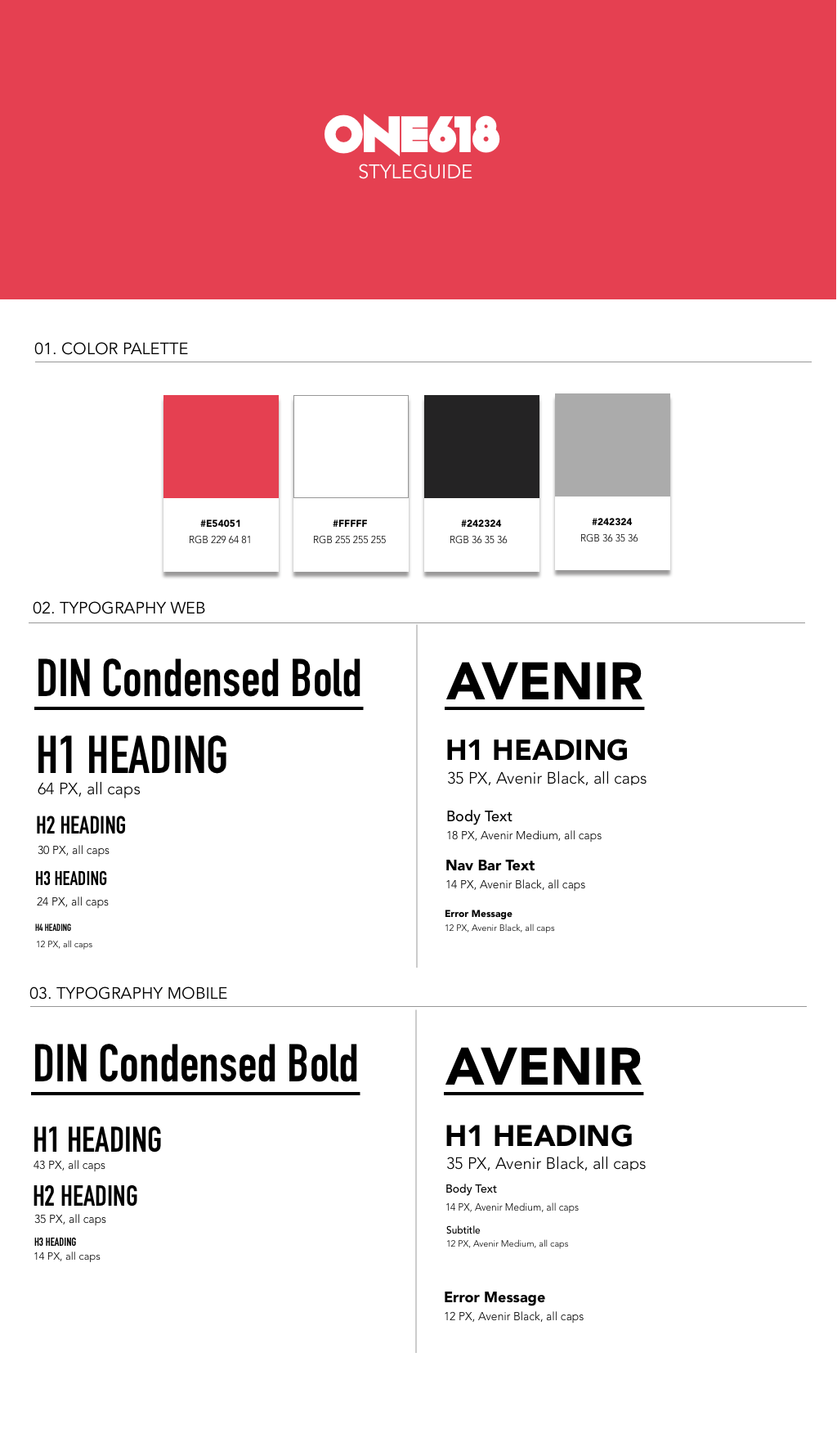
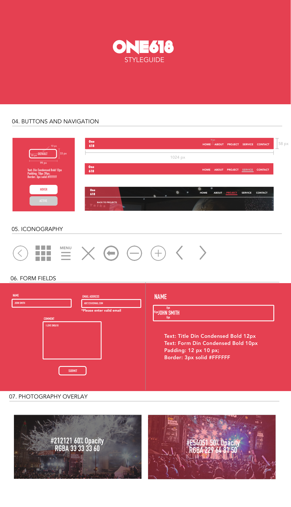
Style Guide
A comprehensive style guide was required with the final designs, which was delivered to the client’s web developer. The guide was required to include specifications such as padding, font size, pixel size of assets, and hex codes for colors. This would be used by the developer as a reference point while programming the designs.