Drinkwel
An e-commerce start-up focused on organic and natural supplements that help support the body.
The Brief
Drinkwel is an e-commerce startup that sells a number of different products through their website and Amazon. The company is one of the very first to develop organic and natural supplements to help support the body. With 92% of sales made on Amazon, Drinkwel wanted to create more branding materials on the site to increase conversions to purchases.
The Challenge
Create new marketing pages on Amazon, their main channel for sales, called Enhanced Branded Marketing Content, for all 13 Drinkwel products while following their strict design guidelines.
For this portfolio we will focus on the design of one Drinkwel product, Revil which is a supplement made for liver support and detox.
Research
In my search to empathize with the user, I found that Amazon reviews were helpful in discovering user goals, pain points, and decision making process behind every purchase. After reading Drinkwel reviews and competitor reviews, I was able to recognize user patterns that helped me create personas for each product.
Personas
User Insights
Ideation
Design Principles
UPDATE VISUALS TO REFLECT BRAND'S HEALTHY LIFESTYLE
Creating a visual brand makes the final product more engaging and relatable.
MAKE DESIGNS SCANNABLE
Users have short attention spans and the final design needs to help them quickly find information they need.
SHOWCASE RELEVANT INFORMATION TO USER
Amazon's Enhanced Brand Marketing Content has over 15 rules and regulations when designing the content. If rules aren't met, your page may be rejected from submission. With so many constraints, the real challenge was to properly convey the right information to the user.
Competitive Analysis
Enhanced Brand Content was recently offered to online sellers in May 2017 as a way to increase sales and brand awareness. Since it is a fairly new concept, there were little to no examples of how an EBC should be designed. The few EBCs I encountered often lacked any informational hierarchy, was usually cluttered with an overwhelming amount of text.
The Result
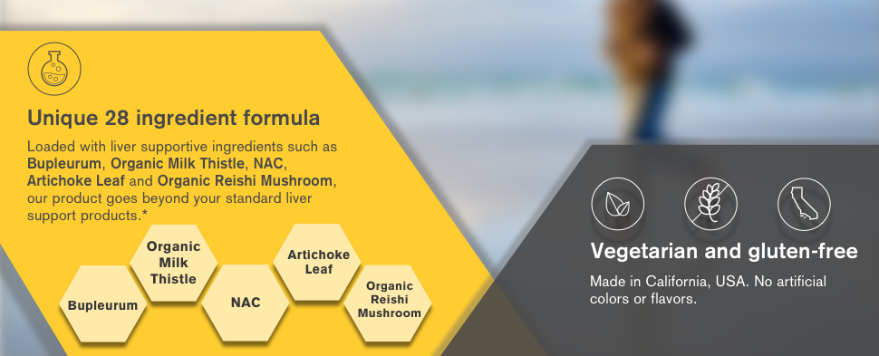
Put the most relevant info on top
Based off research, majority of users wanted to know the specific vitamins that went into Revil and whether it was organic/vegetarian.
Consider different use cases
With 28 ingredients, Revil can do more than just provide liver support. Highlighting various uses for the supplement can compell new users to buy the product.
Branding and imagery
Changing images to convey more of a lifestyle rather than just the product as well as using the bold yellow color to create more of a visual language.
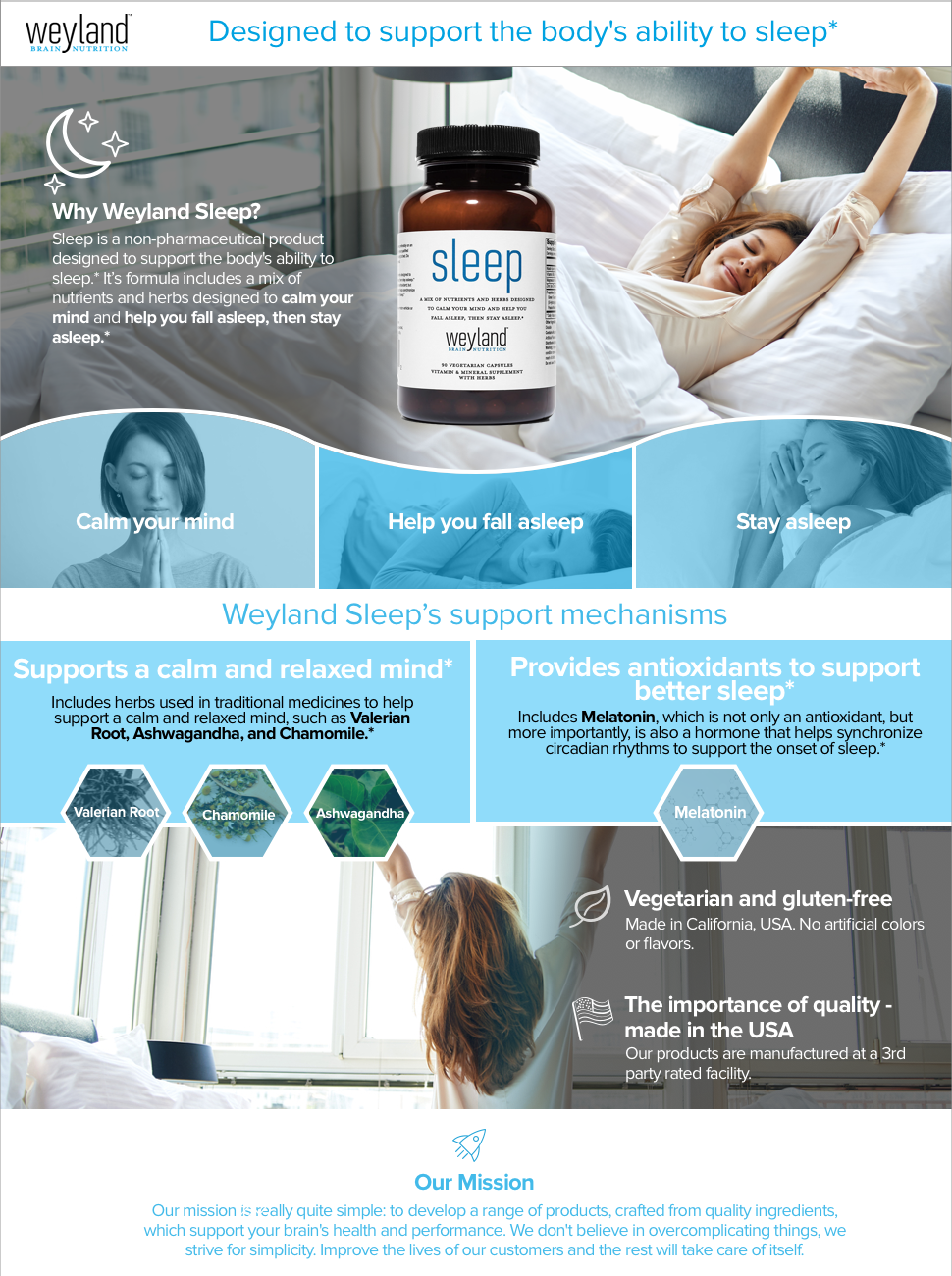
I created over 25 pages for products using the same design method for each. The user insights found from each product dictated my my final designs. After finishing work for Drinkwel, I was asked to create pages for their sister company Weyland.
Results & Final Considerations
Overall sales increased by 10%
The use of branding material helped increase purchases by an average of 5% across all Drinkwel products.
Converting reviews to user data
While reading Amazon reviews, I found that it was a unique space where users actually articulate their goals and pain points. Similar to affinity diagraming, I was given this raw data and had to find patterns which I turned into personas.


