

GoPro
A technology company that creates versatile action cameras, apps and software.


Overview
As sole designer, I was tasked to completely redesign the checkout experience on GoPro.com. As a larger initiative to promote more sales on the website, the business believed that this was a crucial to launch the new checkout flow just in time for the upcoming camera launch.
Business Goals
Design to support increasing amount of mobile users
Help GoPro users discover accessories that will enhance their experience
Showcase subscription program to increase post purchase confidence
The Challenge
Update checkout to better serve new and returning users
Heuristic review of the current website and complete a competitive analysis
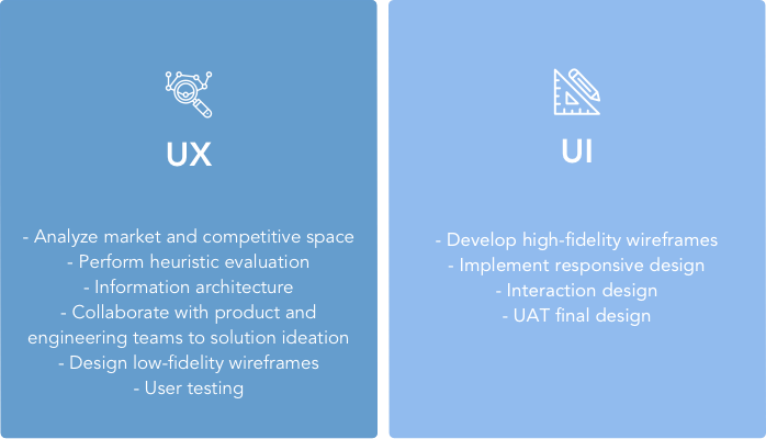
The Process
As the sole designer, I was tasked to evaluate current pain points in the checkout flow, redesign a new experience for the user, and provide the final UI designs.
Research
Heuristic Evaluation
I worked closely with the UX research team to understand users’ pain points from a UX audit of the checkout flow. Here are the main paint points of each finding:

Cart
Pain points:
- Inconsistent UI, specifically different CTAs, font styles, and color palettes make it hard for users to quickly distinguish actionable items on the cart page.

Checkout Log-in
Pain points:
- Users don’t know why they should create an account instead of checking out as a guest.
- Users are required to give personal information such as email on the first step, which can deter them from continuing.

Checkout Shipping + Billing
Pain points:
- Showcasing all steps of the checkout process, especially ones that may not be necessary for the majority of users can cause a cognitive overload.
- Users were confused when the next column forms were disabled - not realizing that the checkbox in the previous step enabled this.
- Users were unable to move forward in checkout process without confirming their address in a pop-up modal.

Checkout Payment
Pain points:
- Paypal users were required to re-enter information that should be automatically filled out when using PayPal.
- Users didn’t know what payment methods are accepted.
- “Review and Complete” terminology was perceived as ambiguous because “complete” was not always interpreted as “BUY”.

Order Summary
Pain points:
- Users would routinely use the back button because they didn’t know how to go to the previous step.
- Users who wanted to return to the previous steps feared losing all the inputted information.
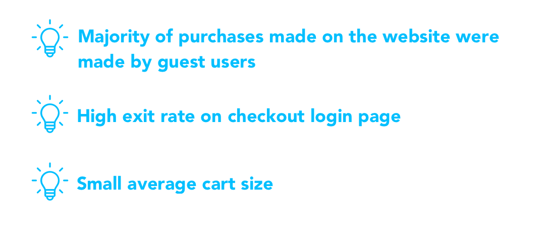
User Insights from Analytics
User Flow
Competitive Analysis

Ideation

Design Principles
SIMPLIFY CHOICES TO REDUCE COGNITIVE LOAD
Don’t overload the user with unnecessary steps. Simplify affordances to guide the user.
GIVE A SENSE OF PROGRESS
Make clearly divided steps and use feedback through UI elements to signify where the user is at in the process.
KEEP CONSISTENT UI PATTERNS AND MESSAGING
Use design patterns and leverage current mental models to increase users’ ability to comprehend and complete the required steps.
Concept Development
After defining design principles, business goals, and main user problems, I sketched out ideas on paper. Using the initial sketches, we performed an internal review with product, engineering, and stakeholders to discuss and refine concepts.
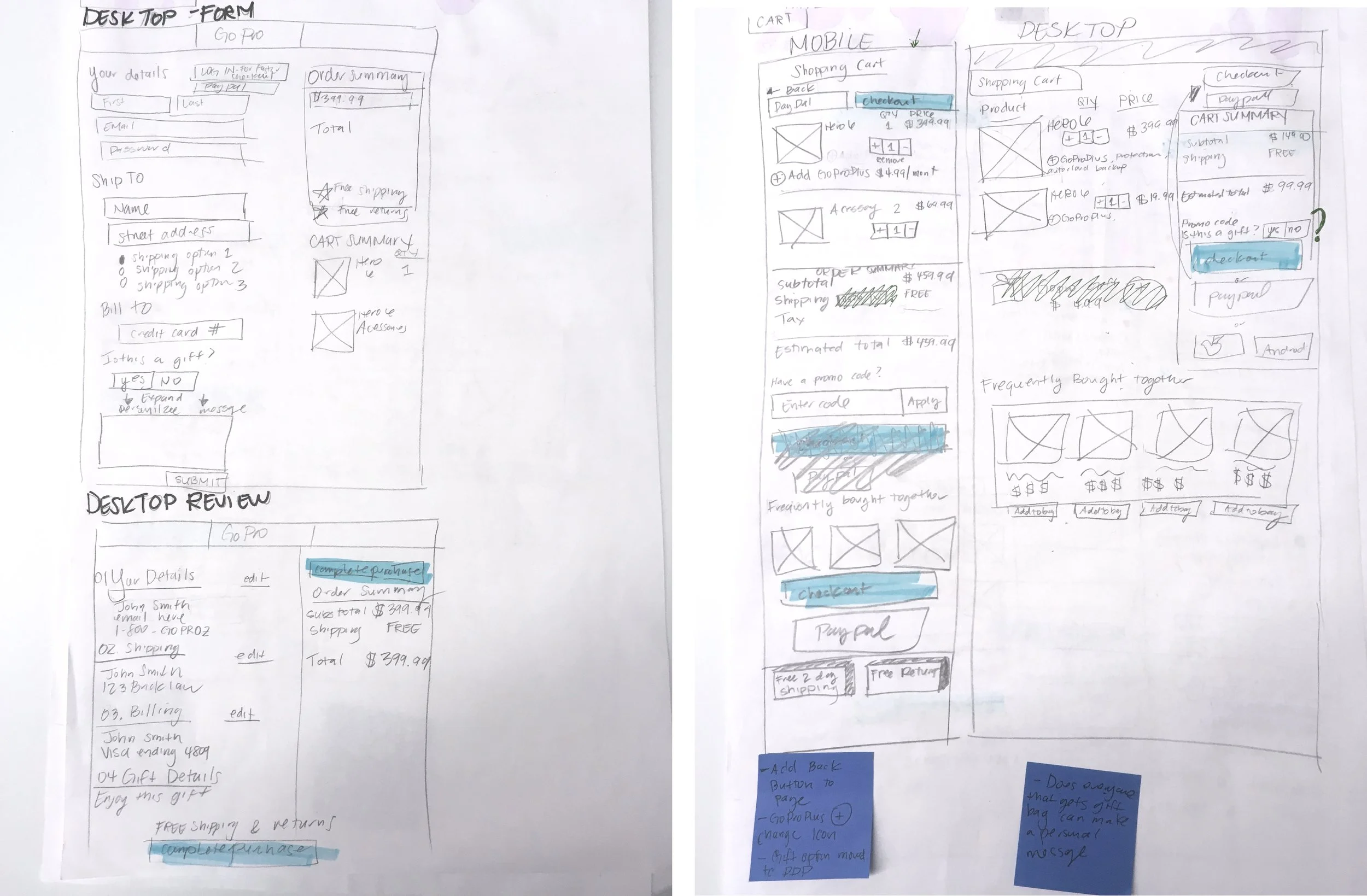
Initial Wireframes


User Testing
Once the team had finalized concepts, I created low fidelity wireframes so that it could be tested with users. I worked with the UX research team to define test goals and user tasks.
Methodology
Unmoderated, task-based, think-aloud usability tests via Userzoom platform
5 mobile shoppers - general population
5 mobile shoppers - current GoPro users
5 desktop shoppers - general population
Test Hypotheses
Changing the layout into expand and collapse sections would improve the usability.
Improving CTAs increases user confidence of what an action does.
Adding sticky elements keeps relevant information available reducing users’ need to jump back and forth between steps.
Adding the new GoPro Plus subscription program
during checkout would not have a negative impact
Key Takeaways
Exposed form fields caused users to skip sections
Users were unable to find shipping options because they missed the shipping field at the bottom of the section that triggers the options.
Sign up and benefits of subscription model were unclear
Users had trouble understanding the basic concept of the GoPro Plus program from the up-sell. Throughout the Checkout and Order Confirmation steps, users didn’t understand how it would be linked to their account and what the next steps were to activate the subscription.
Reduce clutter in cart
Users that viewed their cart, especially on mobile, had to excessively scroll to view all of their cart contents. They also had a hard time finding the quantity and price because they expected it to be in a different area.
The Final Product
We worked with closely with engineering to finalize interactions, animations, and responsive design break points before handoff. After development was complete our team was tasked to user acceptance test the designs of the final product before launch.


Real Time Info Confirmation
Users receive immediate feedback on the information they entered to reduce errors in context instead of waiting to validate at the end of the page.

Mini Cart Instead of Interstitial Page
The mini cart allows users the option to either maintain their browsing experience or continue to the checkout process. The layout creates an opportunity to recommend relevant items that match items in the cart.

Mobile Sticky Price Bar
Research showed that users wanted to be able to reference their cart price since the checkout inputs can change the price. This feature is made sticky throughout the mobile checkout experience to clearly display their cart price and items at all times.
Results & Key Takeaways

Conversion rate increased by 57% over the previous year

42% decrease in time to get through checkout
Include engineering team early and often
While conceptualizing the new checkout, I included the head of engineering to help think of possible solutions for the redesign. Engineers are natural problem solvers and it was highly beneficial to see how they would tackle the problem at a technical level.