

GoPro
A technology company that creates versatile action cameras, apps and software.


Overview
GoPro wanted to increase sales on the website. They found that the website was a major touch point when users researched the product, however very few were compelled to make a purchase.
Our team was given the task to redesign the camera product detail page on gopro.com and apply user centric design to define user problems, increase engagement on the website, and build a fully responsive page that could be launched during the fall 2018 campaign worldwide.
Business Goals
Must include standard e-commerce features (e.g. : add to cart CTA, shipping info), so users can make a purchase
Show comparison of technical specifications to help users decide what camera fits their needs
Integrate full ecosystem of products
Modular design
Design mobile first
The Challenge
Goal is to find out what the current user behavior is when searching for a camera and how they interact with the website.
Redesign the camera product detail page to increase user engagement and conversion.
The Process
Our team consisted of two UX and two UI designers who were responsible for executing all phases of design from UX research to development handoff. My tasks included:

Research
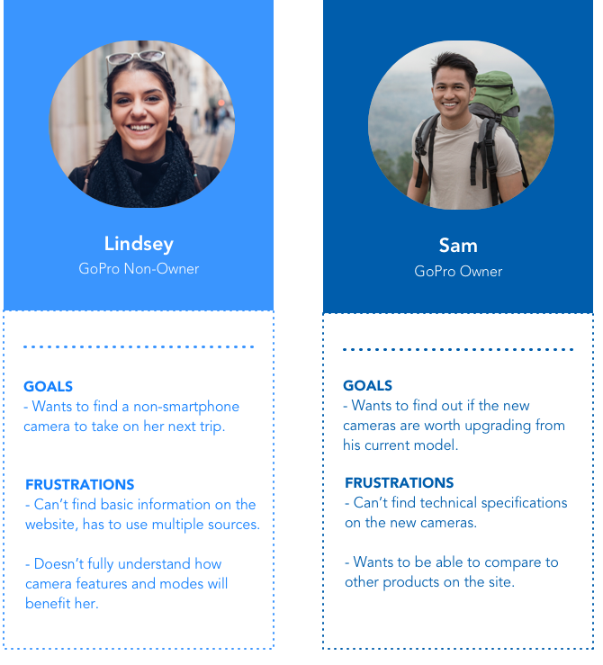
Identifying the User
Our team compiled information from consumer insights, UX research, and customer support to create user personas. With the data from insights through focus groups and user testing, we formulated user problems relating to the website.
User Insights

Competitive Analysis
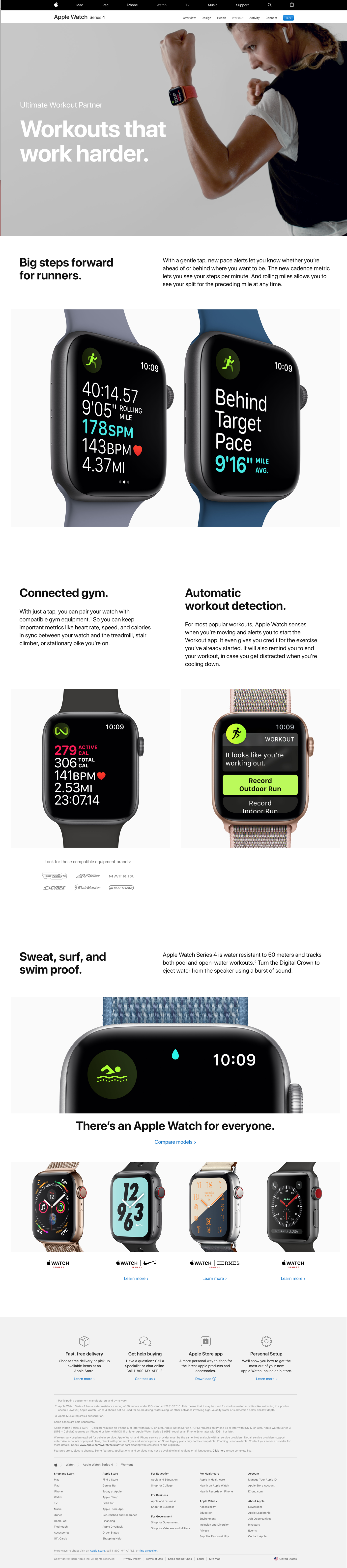
Due to GoPro’s premium product position we looked at other premium branded products such as Google pixel, Samsung 360 camera and Apple Watch to see how they combined education and e-commerce on their product detail pages.

Site Analysis
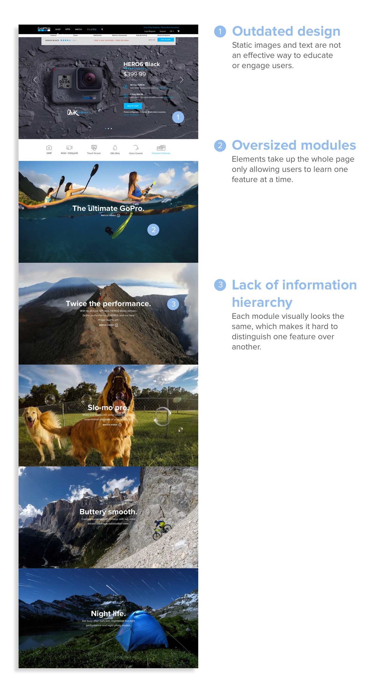
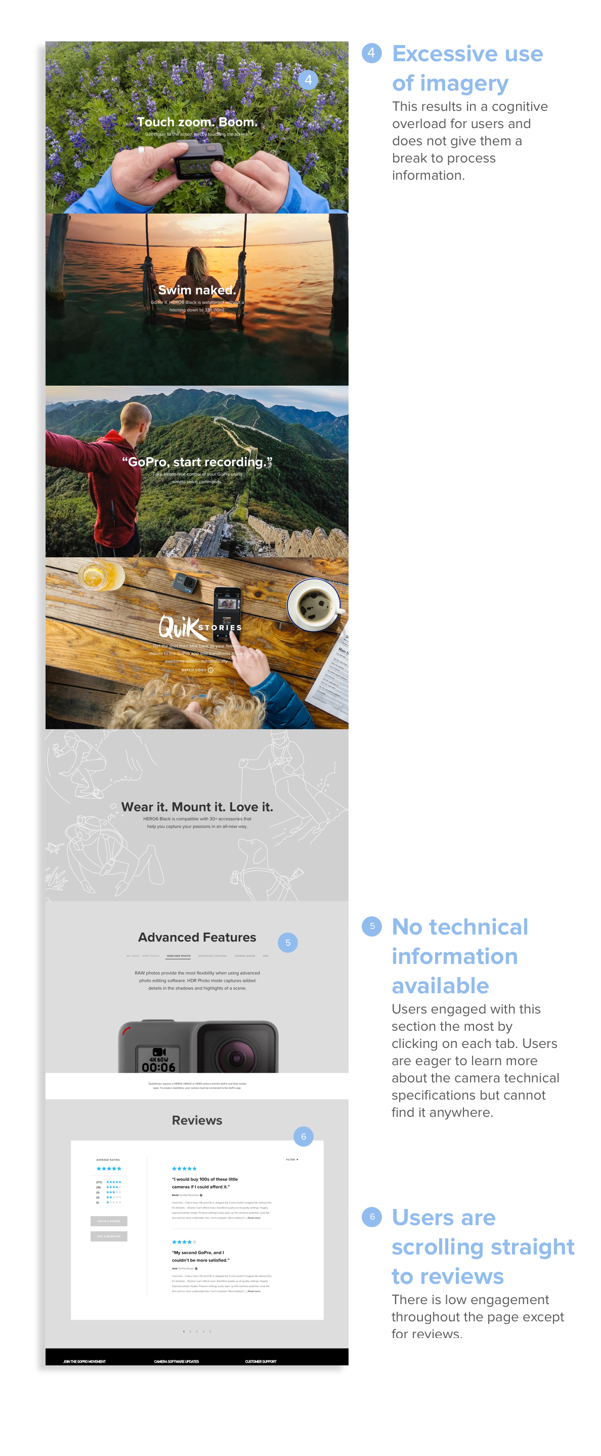
Before redesigning the camera product detail page, our team met with stakeholders to make sure we were aligned on the redesign goals. Some major pain points of the page are:
Ideation

Design Principles
DON’T JUST TELL, SHOW
It was important to precisely use a mixture of photos, videos, animations and to show the benefits of each feature.
BALANCING EDUCATION AND E-COMMERCE
Prioritize the website to first be source of inspiration and education for users, then secondly giving them the right tools to make a purchase on the site.
KEEP IN MIND USER RESEARCH PROCESS FOR GOPRO CAMERAS
Users are going to sites like Youtube, Amazon, tech blogs, and other review sites to learn more about the product. The new design should cater to the tasks users are attempting across these websites to make the page a one-stop-shop experience.
Sketching Concepts
After defining design principles, business goals, and main user problems, each teammate separately sketched out ideas on paper. After the initial sketches, we performed an internal review with product, engineering, and stakeholders to discuss and refine concepts. We eventually came to four main ideas that were presented to stakeholders.
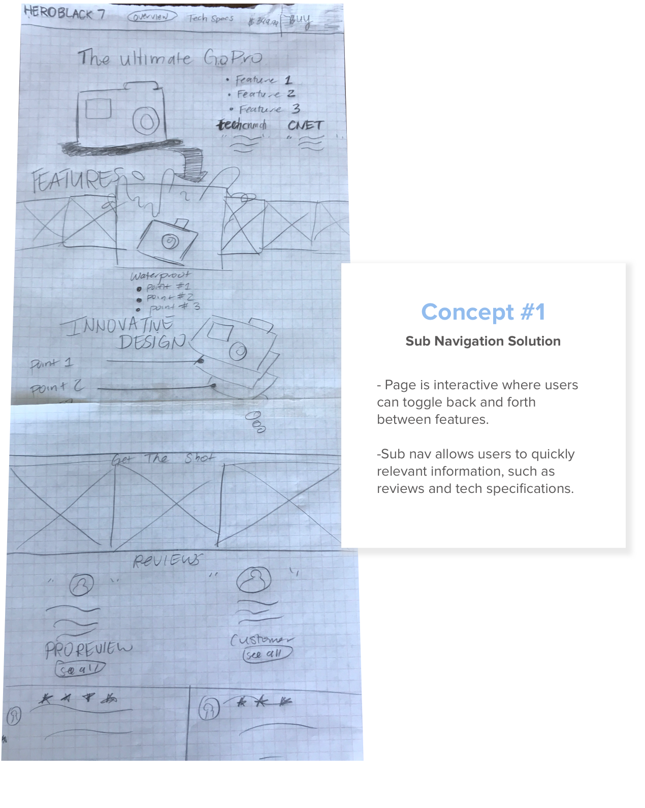
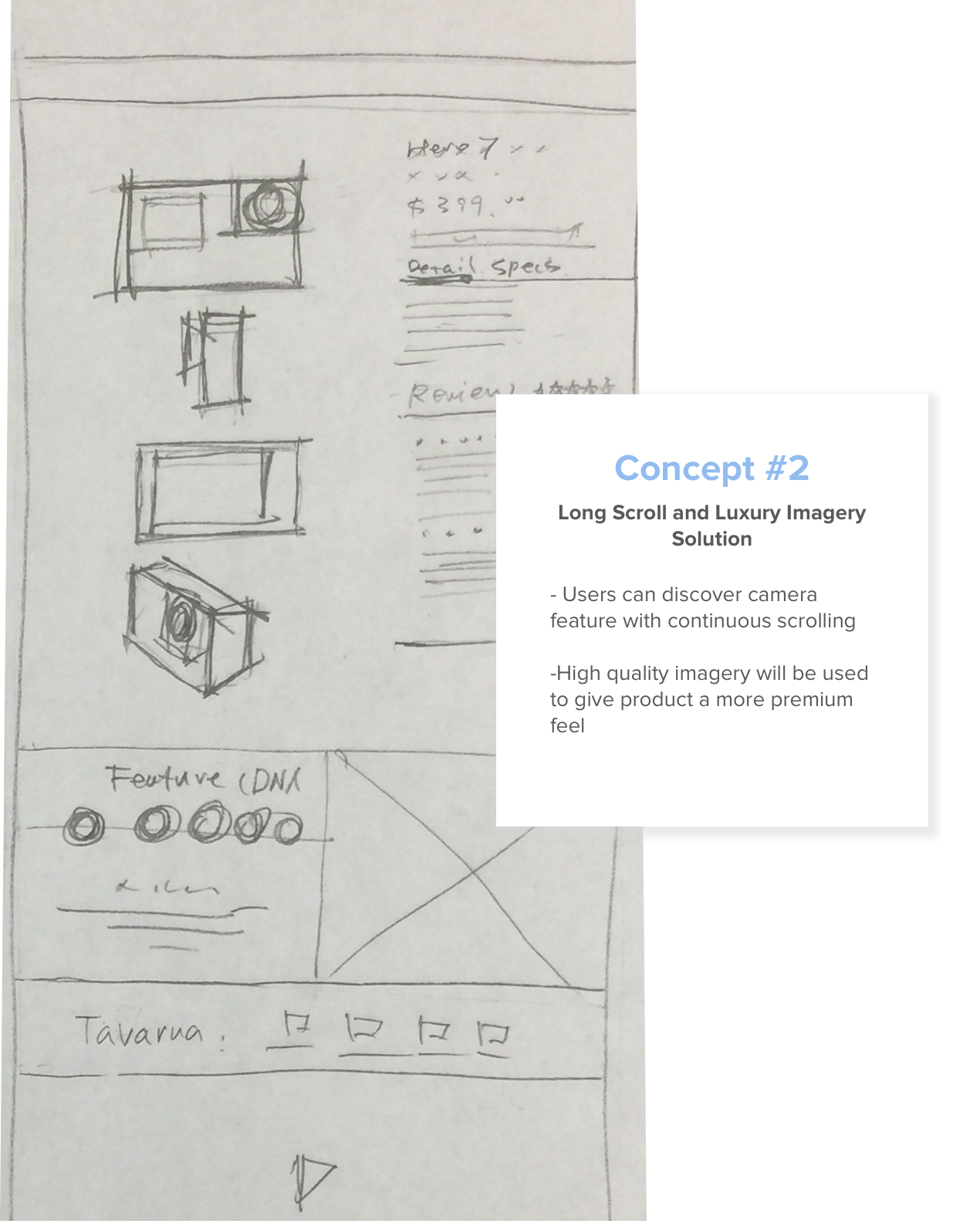
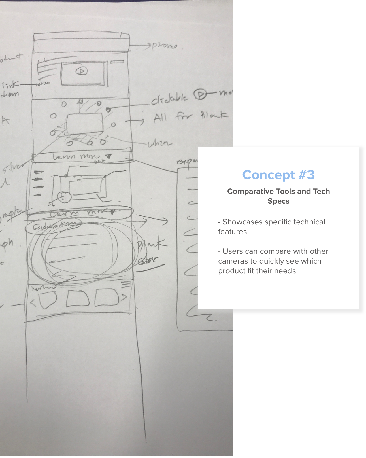
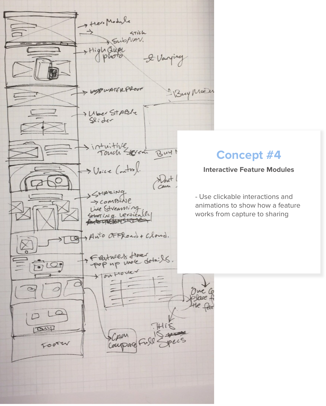
Once our team finalized the four concepts, we presented the ideas to the CEO and stakeholders by using low-fidelity wireframes. We eventually went with concept 1 for its ease of use and flexible modular design but also added features from the other concepts such as the comparison tool and interactive features.
The Final Product
We worked closely with engineering to solution interactions, animations, and responsive design break points. After development was complete our team was tasked to UAT the final product before launch.

Sticky Navigation
Allows users to easily navigate the product detail page and quickly buy once they’ve made a decision. This also broke up long pages in tabs which allow users to dig into details only if they want to.

Educational Animations and Video
We used looping videos, GIFs and animations to intrigue and educate users on features.

Feature Tabs
Broke up long pages in tabs that allow users to dig into details only if they want to.
Camera Compare Tool
We wanted to allow users to compare each model quickly and efficiently.

Results & Key Takeaways

Conversion rate increase 5x over the previous year

35% increase time spent on website

4% Decrease in bounce rate
Measuring user feedback post launch
After creating the page, it is important to include ways to quantify user feedback and allow for more iterative design.
Building a design culture
The challenge to find ways to implement more user-centric design in the current process and explaining the benefits was a major obstacle in this project. Including the user at the center of every design step allowed us to empathize to create solutions to their largest problems. Introducing this new approach had a large impact to the project and will be further improved on subsequent projects.